
Clean. Chic.
In Charge.

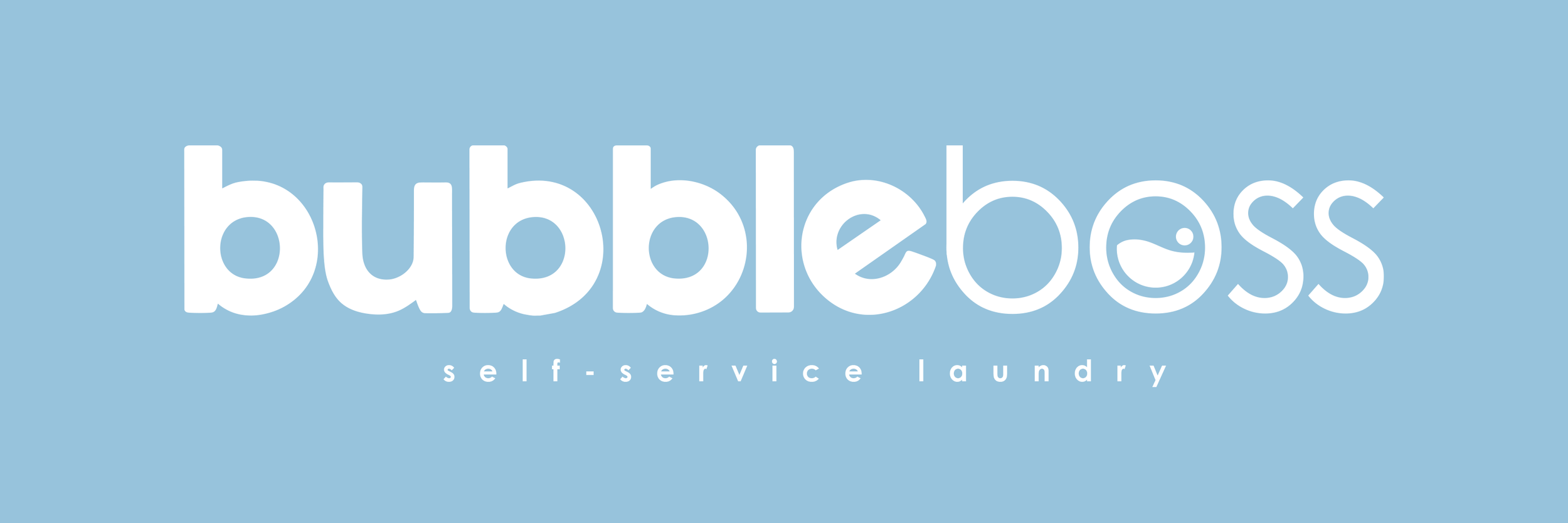

[Laundromat Name] – Modern, Fast, and Hassle-Free Laundry
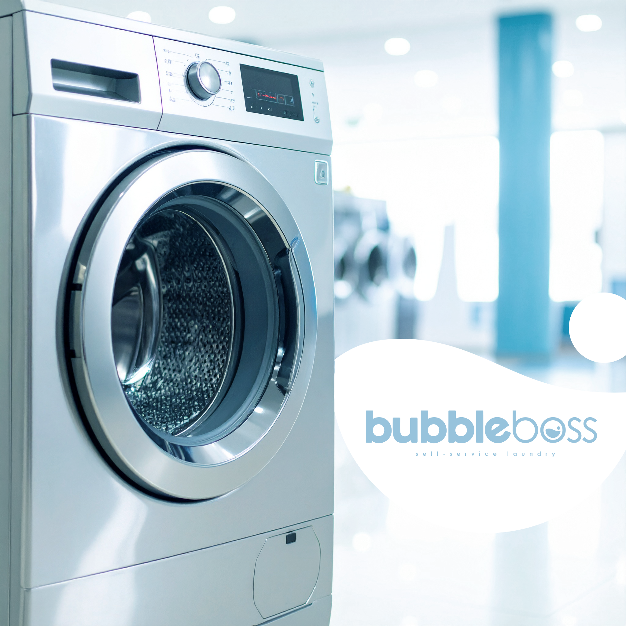
[Brand Name] is a contemporary self-service laundromat in Australia, designed for busy people who value speed, cleanliness, and convenience. Our state-of-the-art machines, modern facilities, and intuitive layout make doing laundry effortless — whether you’re a professional on the go, a student, or a family managing a busy household.
We focus on efficiency without compromise, ensuring every visit is simple, safe, and satisfying. From quick washes to full-service options, [Brand Name] is more than just a laundromat — it’s a modern solution for clean clothes, hassle-free.
Clean. Fast. Reliable. [Brand Name] makes laundry easy.

THE BRIEF
Client Overview
Business Type: Self-service laundromat
Location: Australia
Positioning: Modern, clean, and customer-focused
Unique Selling Points: Fast, hygienic, and easy-to-use facilities; reliable self-service experience; designed for busy urban customers
Design Aim / Goal
The branding project aimed to position the laundromat as a modern, approachable, and trusted brand, reflecting efficiency, cleanliness, and ease of use. Key objectives:
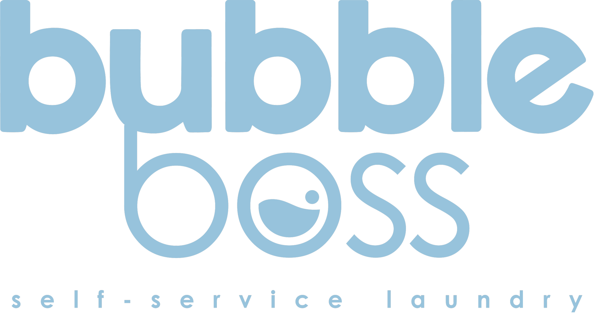
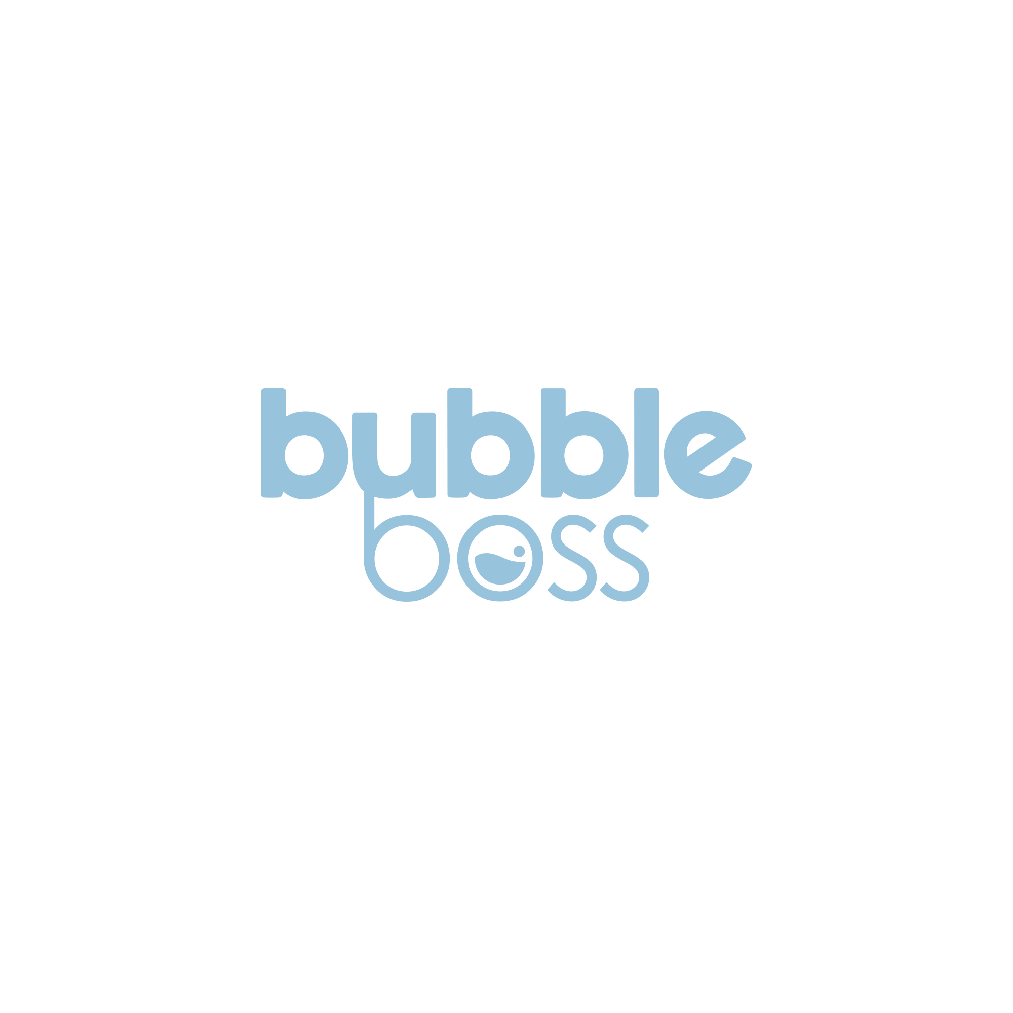
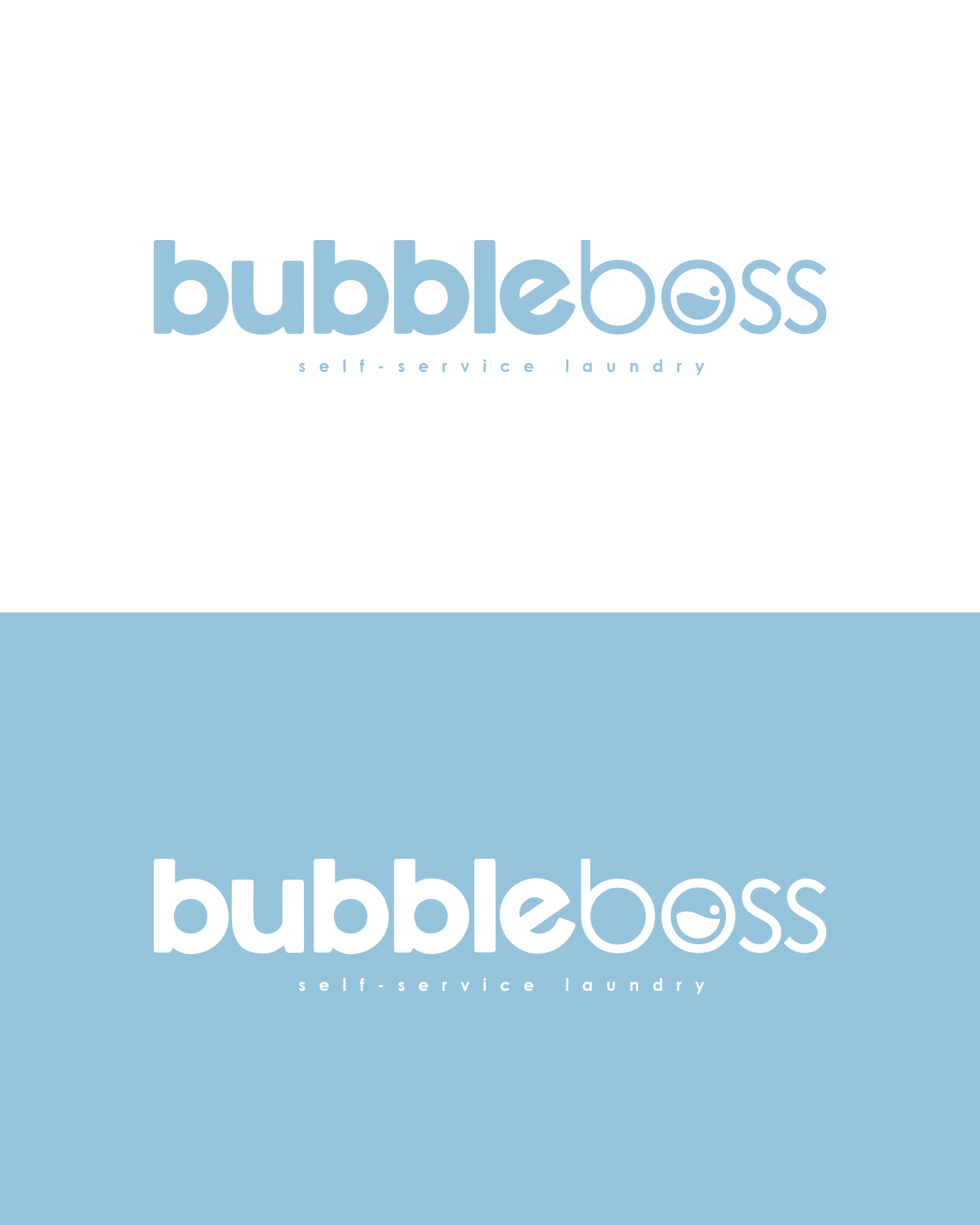
Modern & Clean Visual Identity: The blue and white color palette communicates freshness, hygiene, and professionalism.
Trust & Reliability: Build customer confidence that the laundromat is clean, safe, and efficient.
Convenience & Ease: Highlight a user-friendly, self-service experience that saves time and reduces stress.
Memorable Brand Presence: Create a distinctive, recognizable identity that stands out in the local market.
The brand should resonate with urban dwellers, young professionals, and families, presenting the laundromat as a place that makes laundry fast, simple, and stress-free.
Target Audience
Urban professionals who value convenience and speed.
Young families looking for accessible, hygienic, and easy-to-use laundry services.
Students and renters seeking affordable, reliable, and modern self-service options.
Age range roughly 18–45, tech-savvy, busy lifestyles.
SkyPotion’s Approach
SkyPotion will craft a strategic, cohesive, and modern brand identity that communicates cleanliness, efficiency, and trust:
Visual Identity
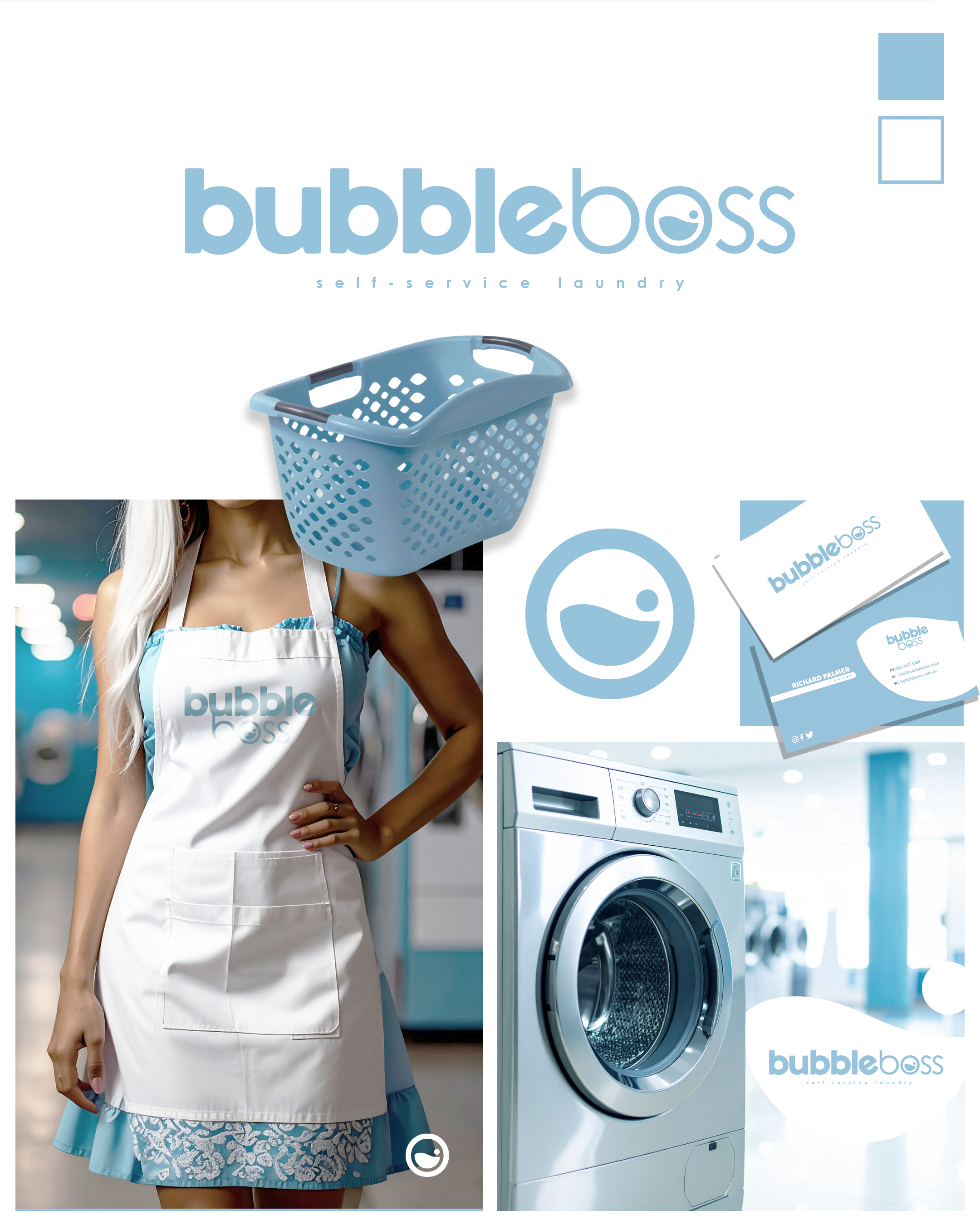
Logo Design: Sleek, simple, and versatile — works on signage, uniforms, and digital platforms.
Typography: Clean, readable fonts that feel modern and approachable.
Color Palette: Blue and white, evoking cleanliness, freshness, trust, and calm efficiency.
Brand Assets
Facility signage, loyalty cards, social media templates, and marketing materials that feel consistent and professional.
Cohesive visual system ensures instant recognition and confidence at every customer touchpoint.
Messaging & Tone of Voice
Clear, friendly, and practical copy that emphasizes ease, speed, and reliability.
Short, memorable phrases that make a mundane task feel quick and stress-free.
User Experience
Design ensures intuitive interactions within the facility and online.
Seamless branding across physical signage, social media, and digital communications to reinforce trust and recognition.
Expected Outcome
By combining clean blue-and-white visuals, modern design, and strategic messaging, SkyPotion will help the laundromat:
Stand out as a fresh, modern, and trustworthy self-service laundry option.
Communicate cleanliness, speed, and reliability at every touchpoint.
Build a cohesive and professional brand identity that works in physical spaces, social media, and local marketing campaigns.
Make the laundry experience simple, memorable, and approachable.