


Sweet
heat.


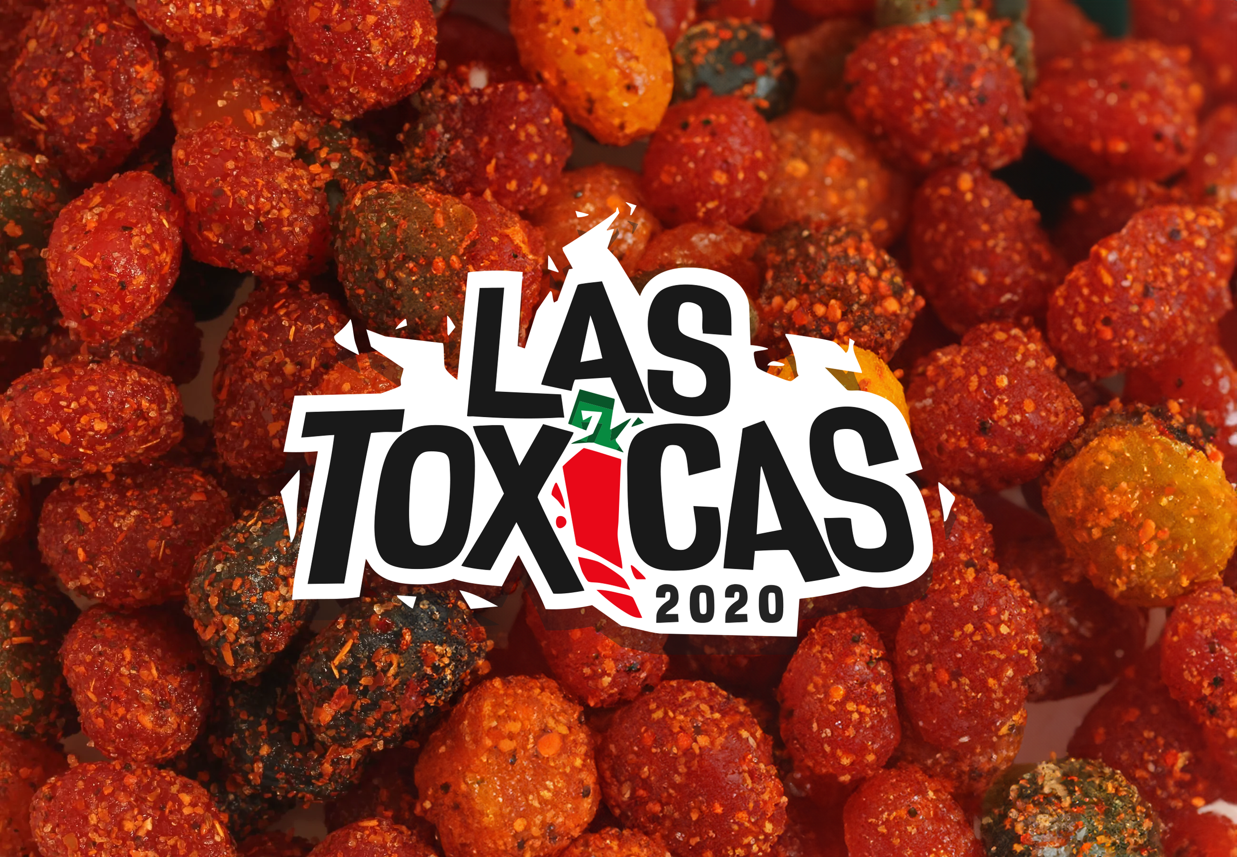
This Mexican spicy candy brand delivers bold, flavour-packed sweets inspired by traditional Mexican recipes and culture. Known for its distinctive balance of heat, sweetness, and attitude, the brand celebrates flavour without compromise.
With a striking red, green, black, and white visual identity, the company stands out instantly on shelves and online—capturing the energy, spice, and authenticity at the heart of its products. Every detail, from packaging to messaging, is designed to reflect confidence, playfulness, and cultural pride.
The result is a candy brand that doesn’t play it safe. It invites customers to embrace big flavour, bold design, and a sense of fun—creating a memorable experience that’s as daring as it is delicious.

the brief
Client Overview
Business Type: Mexican candy manufacturer / retailer
Location: United States
Positioning: Bold, fun, and authentic
Unique Selling Points: Spicy candies with traditional Mexican flavors; high-quality ingredients; a playful, adventurous experience for candy lovers
Design Aim / Goal
The branding positions the candy company as bold, vibrant, and instantly recognizable, appealing to adventurous candy lovers while conveying cultural authenticity.
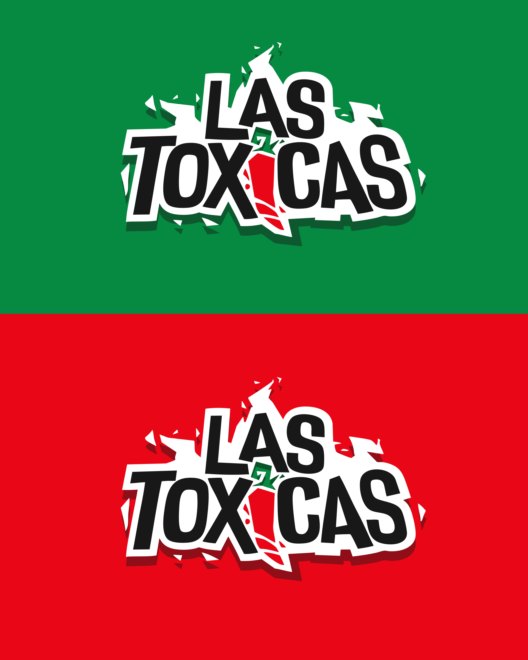
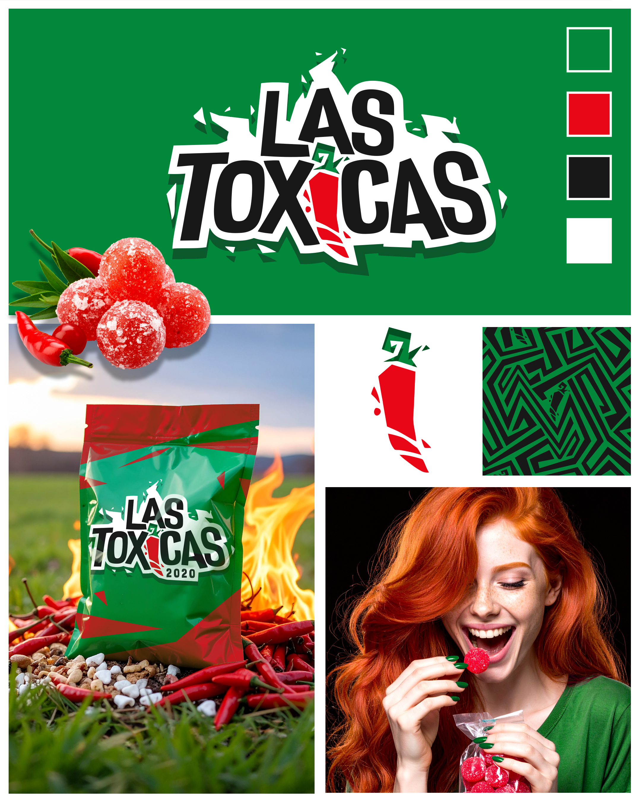
Bold & Energetic Identity: The red, green, black, and white palette communicates heat, flavor, and excitement.
Authenticity & Heritage: Design motifs and typography reflect traditional Mexican candy culture.
Memorable & Shareable: The brand is eye-catching and social media-ready, encouraging engagement and sharing.
Flexible Branding: The identity works seamlessly across packaging, retail displays, and digital platforms.
The brand resonates with kids, teens, young adults, and candy enthusiasts, creating an experience that is fun, daring, and unforgettable.
Target Audience
Kids and teens: Drawn to bright, energetic colors and playful visuals.
Young adults (18–35): Excited by adventurous flavors and shareable experiences.
Candy enthusiasts: Seek unique, authentic Mexican spicy candy with bold personality.
SkyPotion’s Approach
SkyPotion establishes a strategic, playful, and cohesive brand identity that reflects the heat, fun, and cultural flair of Mexican candy:
Visual Identity
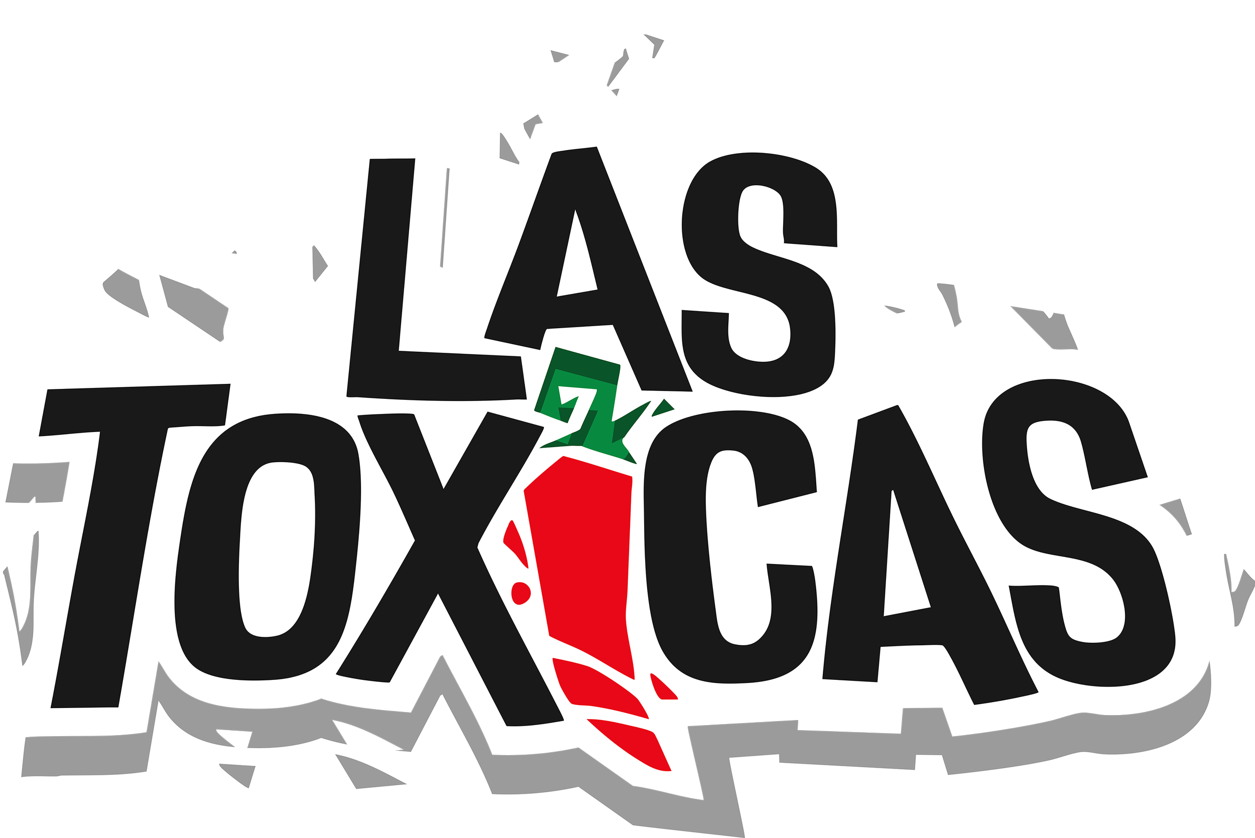
Logo Design: Bold, vibrant, and flexible for packaging, social media, and promotions.
Typography: Playful yet legible fonts with a touch of Mexican heritage.
Color Palette: Red, green, black, and white, evoking spice, energy, fun, and authenticity.
Brand Assets
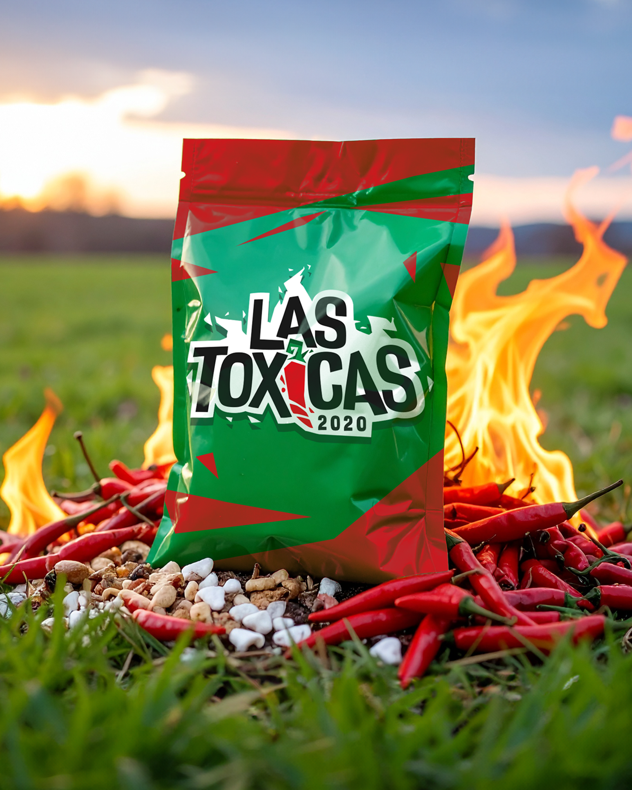
Packaging, wrappers, point-of-sale materials, social media templates, and promotional graphics create a cohesive, instantly recognizable visual system.
Messaging & Tone of Voice
Bold, playful, and cheeky copy emphasizes flavor, spice, and adventure.
Short, memorable phrases encourage customers to try, share, and enjoy the candy.
User Experience
Packaging stands out on shelves, clearly communicates flavor and reflects the candy’s bold personality.
Digital presence on social media and website is fun, shareable, and visually vibrant, driving engagement and excitement.
Expected Outcome
The branding positions the Mexican spicy candy company as a vibrant, bold, and playful brand that:
Captures attention in a competitive candy market.
Communicates authenticity, quality, and adventurous flavor in every interaction.
Maintains a cohesive identity across packaging, digital, and promotional platforms.
Creates a fun, daring, and memorable experience for every customer.