


rejuvenate
Skin deep.
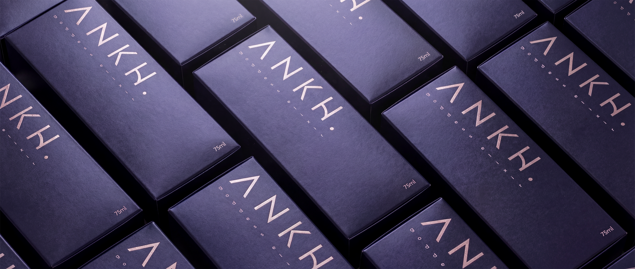
Luxury skincare brand identity design case study for a feminine wellness oil brand



rejuvenate
Skin deep.
This luxury skin oil brand creates refined, high-performance oils designed to nourish, restore, and elevate modern skincare rituals for women.
Rooted in purity, intention, and elegance, the brand blends premium ingredients with a timeless aesthetic that feels both contemporary and enduring.
Subtle references to Egyptology, long associated with beauty, ritual, and feminine power, are woven delicately into the brand’s visual language.
The result is a skincare identity that feels sacred, confident, and quietly luxurious.
Want to see the finished Project?
Visit: Instagram

THE BRIEF
Design Aim / Goal
The brand identity communicates femininity, strength, and refinement through sleek minimalism and restrained symbolism.
Sleek & Elevated: Clean lines, generous spacing, and refined typography create a calm, premium presence.
Feminine Power: Light Egyptological references subtly evoke ritual, wisdom, and beauty without overpowering the modern aesthetic.
Timeless Luxury: The branding avoids trends, focusing instead on longevity and elegance.
Versatile & Scalable: The identity translates seamlessly across packaging, e-commerce, social media, and print.
The brand feels confident, sensual, and intentional — designed for women who value substance as much as beauty.
Target Audience
Women seeking premium skincare with purpose and presence
Wellness-driven consumers who appreciate ritual and self-care
Design-conscious buyers drawn to minimal, editorial aesthetics
Modern women who value quality, calm, and quiet confidence
SkyPotion’s Approach
SkyPotion develops a cohesive, high-end brand identity that balances modern minimalism with symbolic depth:
Visual Identity
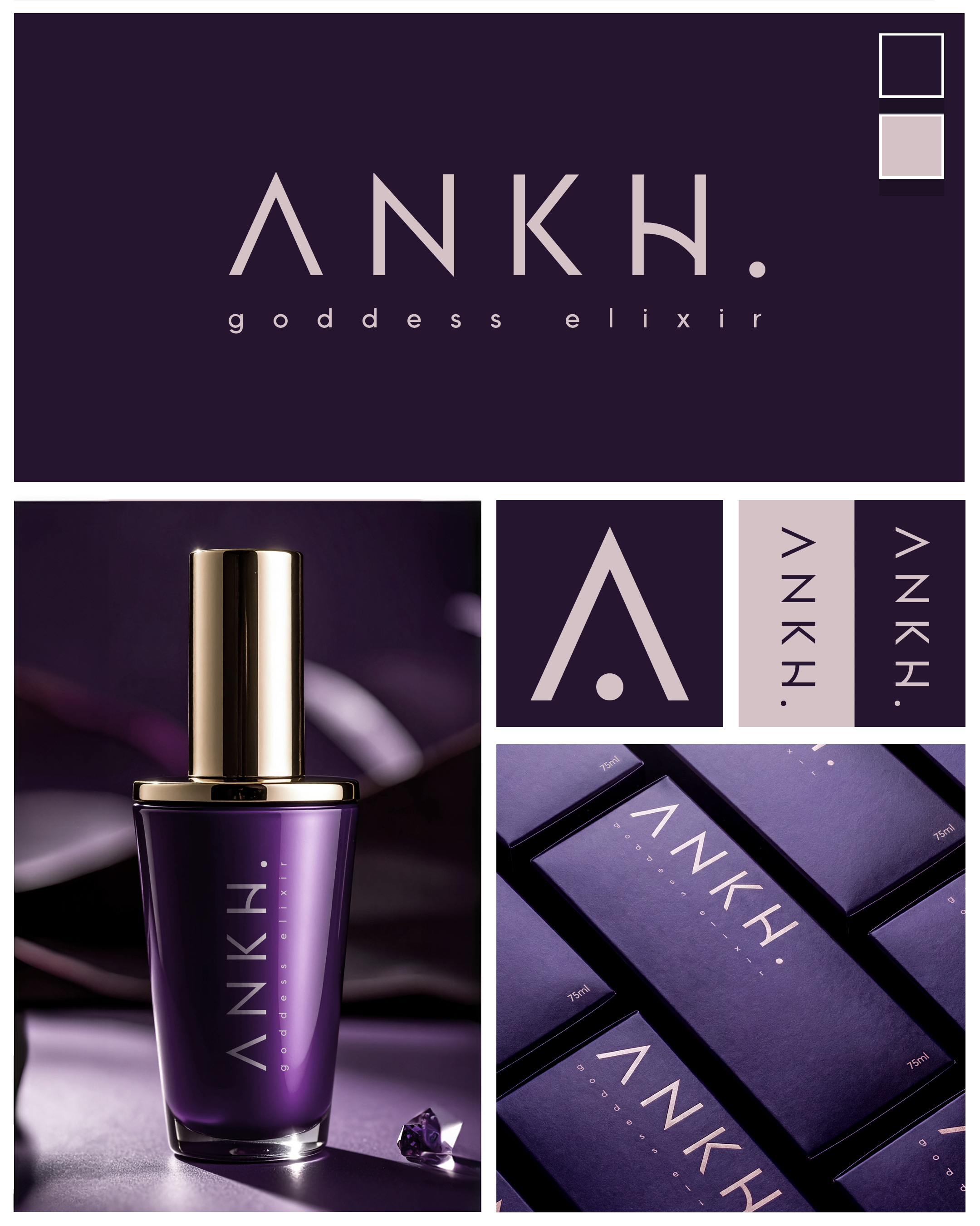
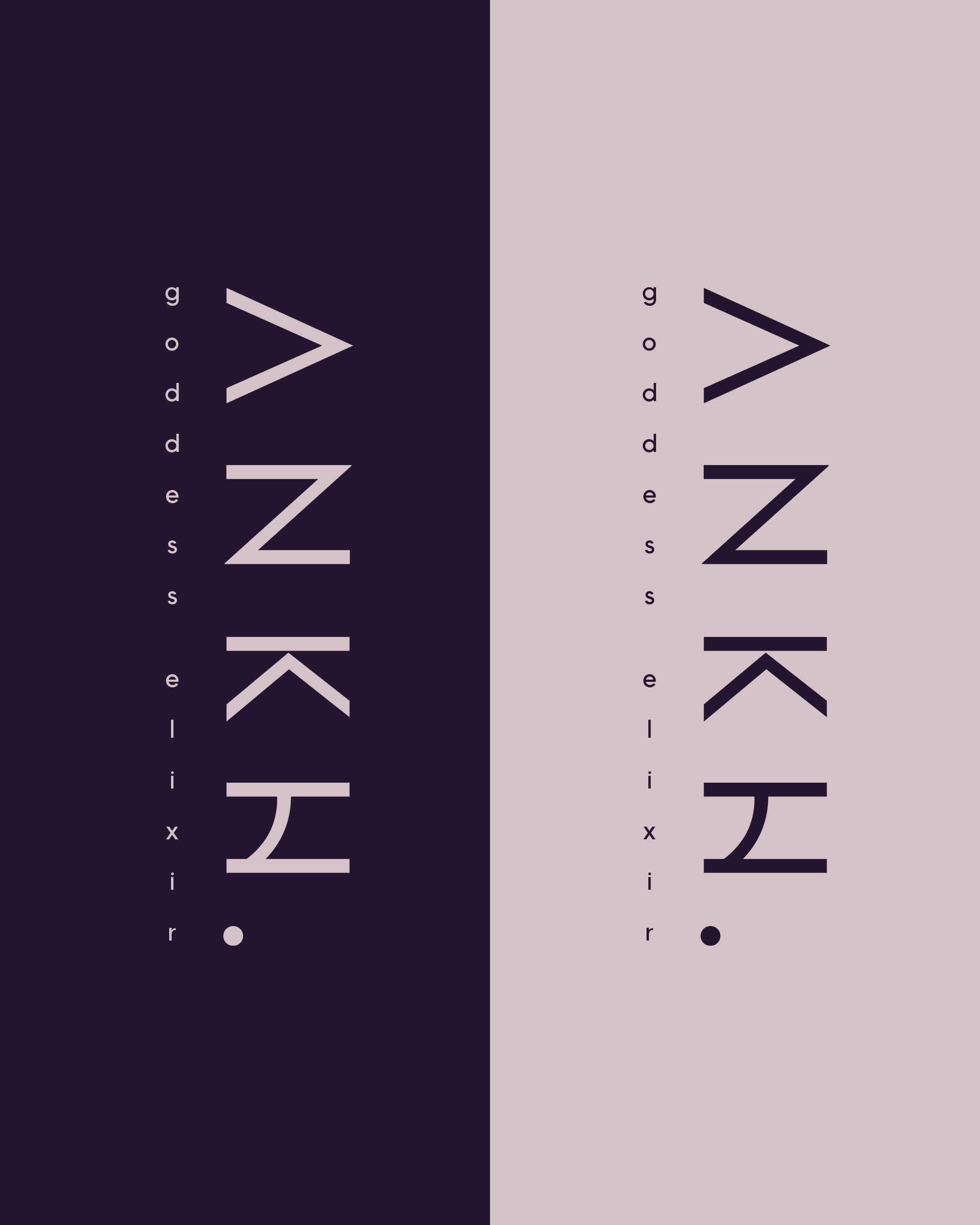
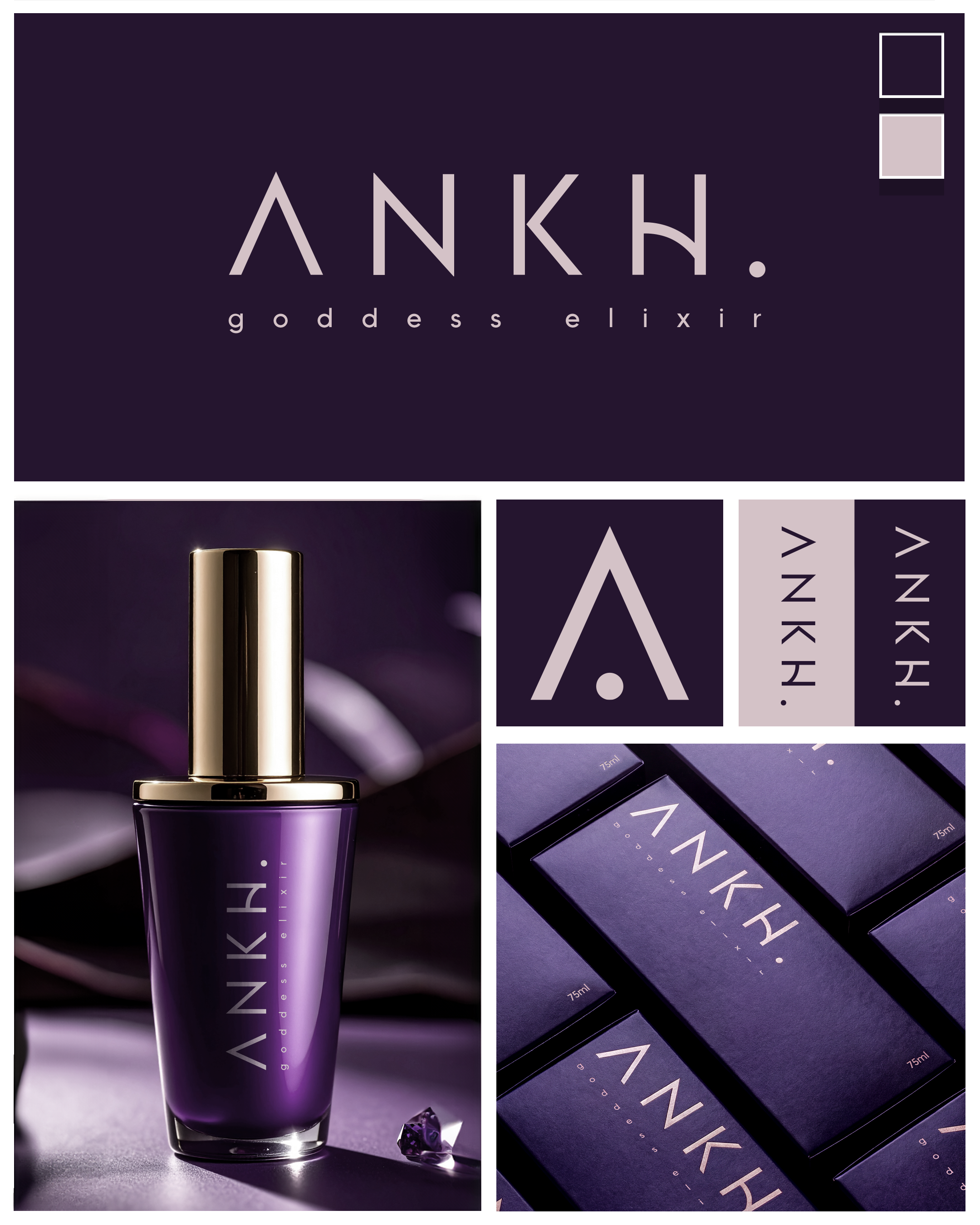
Logo Design: Refined and elegant, with subtle nods to ancient symbolism expressed through modern form.
Typography: Clean, sophisticated typefaces that communicate softness, strength, and clarity.
Color Palette: Soft neutrals, warm metallic accents, and muted tones that evoke purity, ritual, and luxury.
Brand Assets
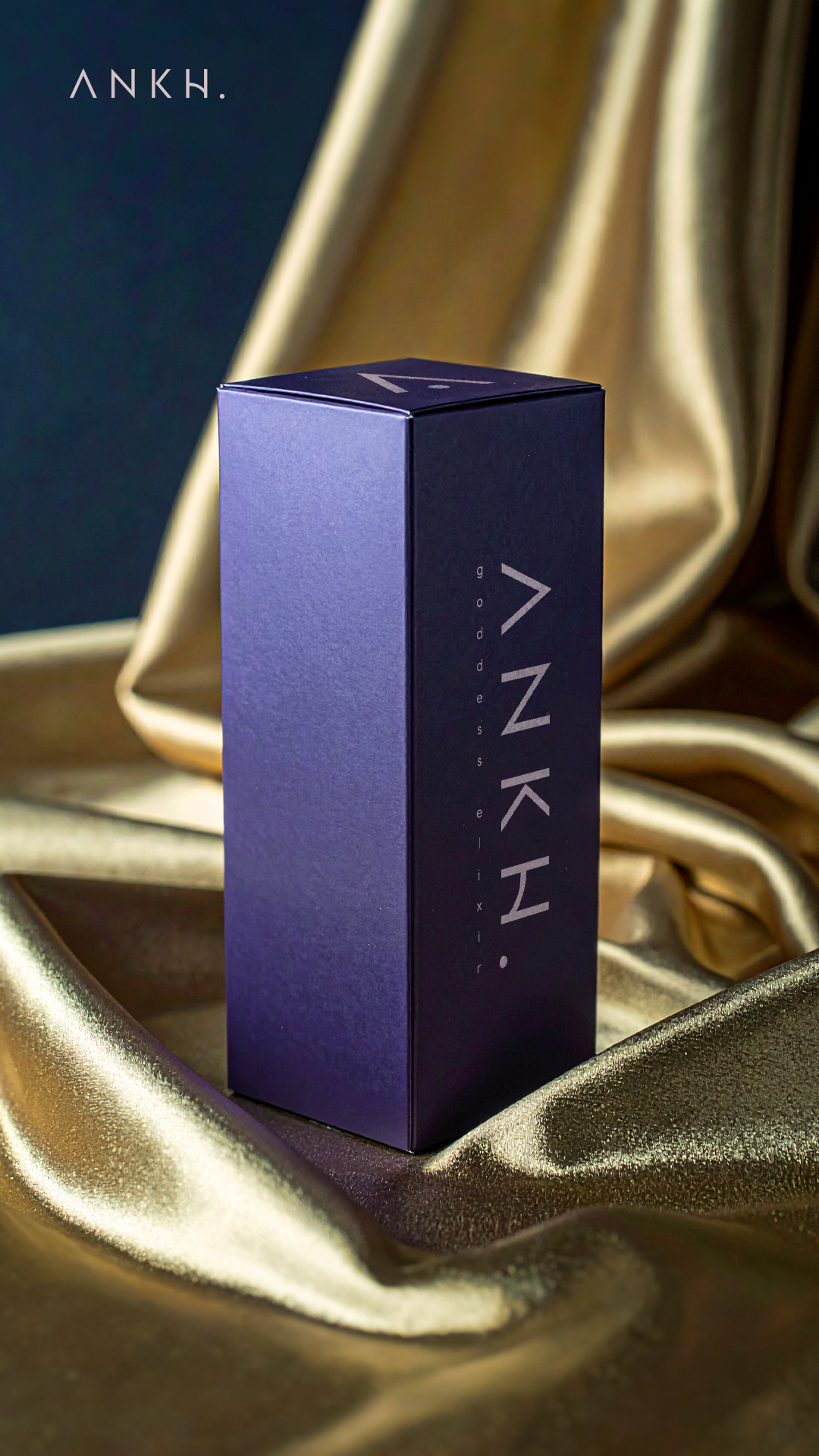
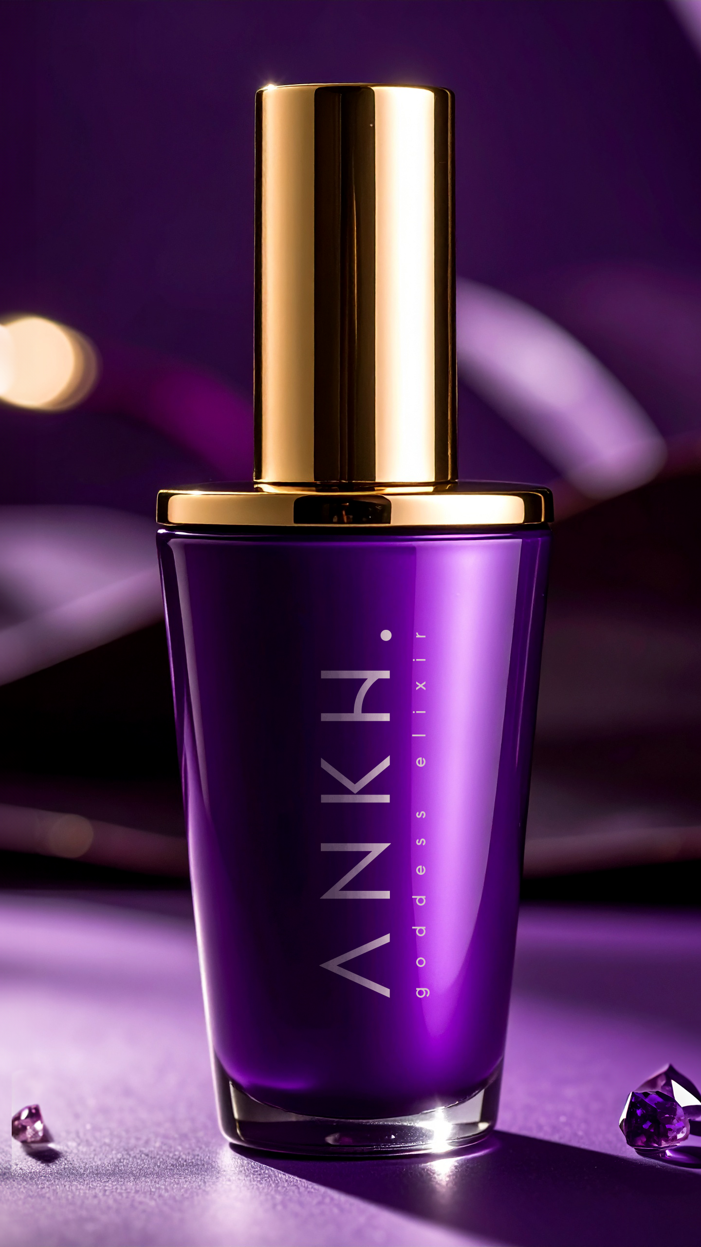
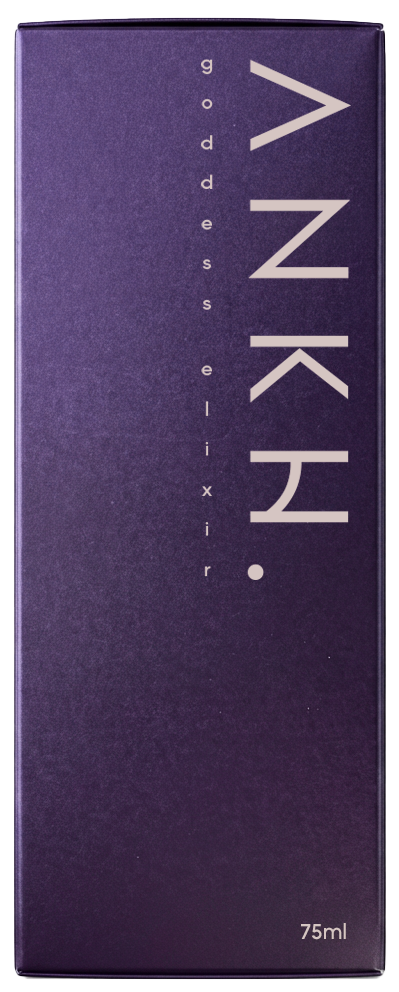
Packaging, labels, and digital assets form a unified visual system that feels intentional and premium.
Every element supports the brand’s calm, elevated tone.
Messaging & Tone of Voice
Poised, assured, and feminine — never loud or over-explained.
Language centers on ritual, transformation, and self-connection.
User Experience
Packaging feels tactile and ceremonial, reinforcing the idea of skincare as ritual.
Digital touchpoints mirror this experience through clean layouts, slow pacing, and thoughtful storytelling.
Outcome
The completed brand positions the luxury skin oil company as a modern, feminine skincare label that:
Feels powerful yet understated
Blends ancient influence with contemporary design
Communicates trust, quality, and intention
Creates a refined, immersive experience across every touchpoint
This is skincare as ritual — minimal, meaningful, and designed to endure.