


Fitness studio brand identity design case study in Australia
Strength
Engineered

Strength
Engineered
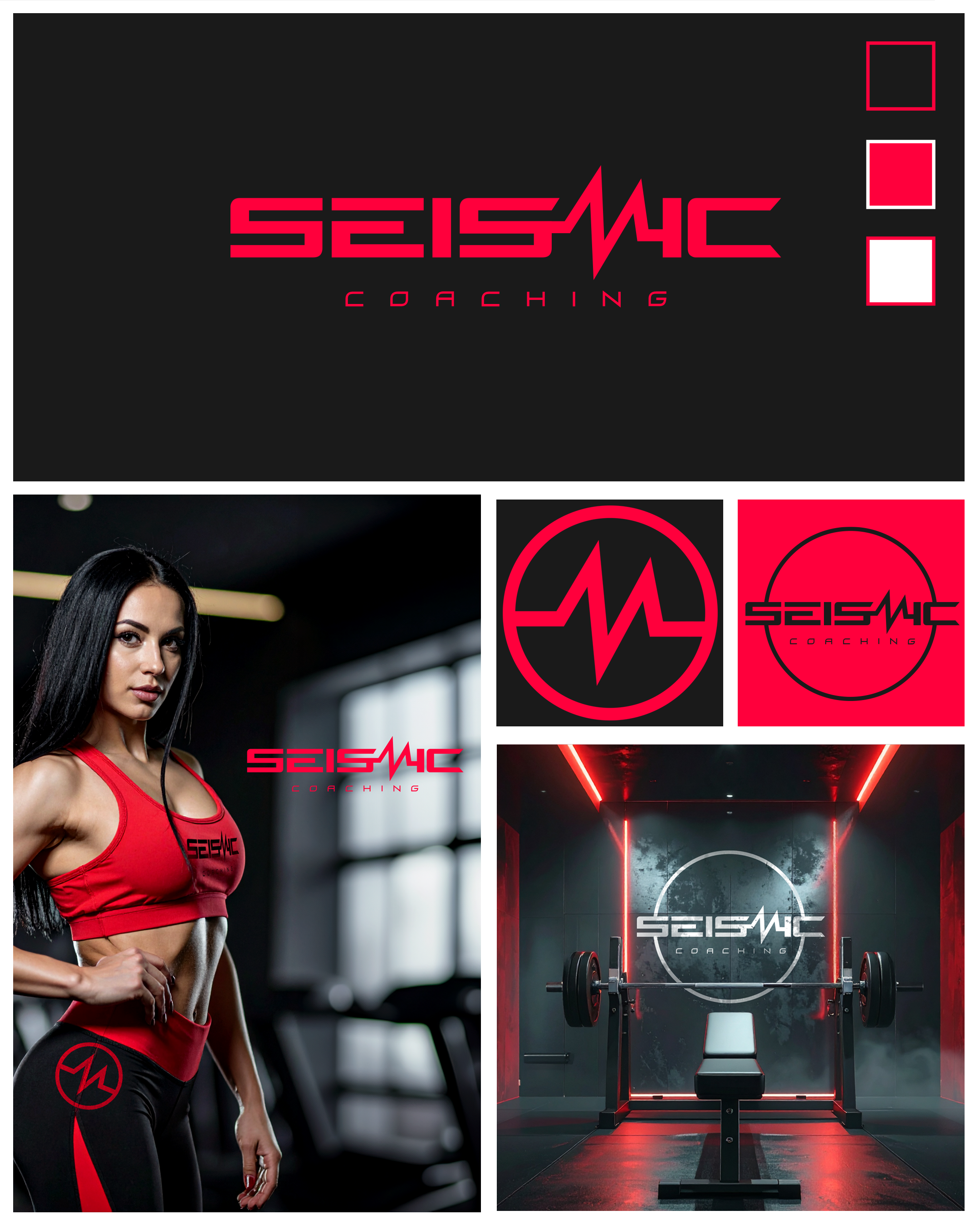
Seismic Coaching is an elite personal training studio in Australia, designed for clients who want results, intensity, and a premium fitness experience. With highly qualified trainers, bespoke programs, and a focus on performance, every session is crafted to push limits and deliver transformation.
Our bold neon pink/red and black palette reflects the studio’s energy, modernity, and drive, creating an environment that motivates clients to train harder and smarter. Whether it’s strength, conditioning, or personal transformation, Seismic Coaching provides a dynamic, professional, and inspiring fitness experience.
Train with purpose. Transform with results. Seismic Coaching is where elite fitness meets modern design.
the brief
Client Overview
Brand Type: Elite personal training / fitness studio
Location: Australia
Unique Selling Points: High-performance training, custom programs, elite-level expertise, motivating environment
Colour Palette: Neon pink/red and black (dynamic, energetic, modern)
Design Aim / Goal
The branding positions the studio as a premium, high-energy personal training brand, communicating:
Energy & intensity: The brand feels dynamic, motivating, and modern.
Elite professionalism: It communicates expertise and high-level training results.
Confidence & transformation: Inspires clients to push themselves and trust the training process.
Modern and bold: Reflects current fitness trends and appeals to aspirational clients.
The branding stands out in a competitive market, attracting motivated individuals seeking a premium, transformative fitness experience.
Target Audience
Age 20–45, fitness-conscious professionals and enthusiasts
Clients who want personalized, high-performance training
Individuals motivated by results, transformation, and an energetic, bold environment
Socially engaged, active on Instagram and TikTok, appreciating visually striking branding
SkyPotion’s Approach
SkyPotion creates a strategic, high-impact visual identity that mirrors the energy and modernity of the studio:
Visual Identity
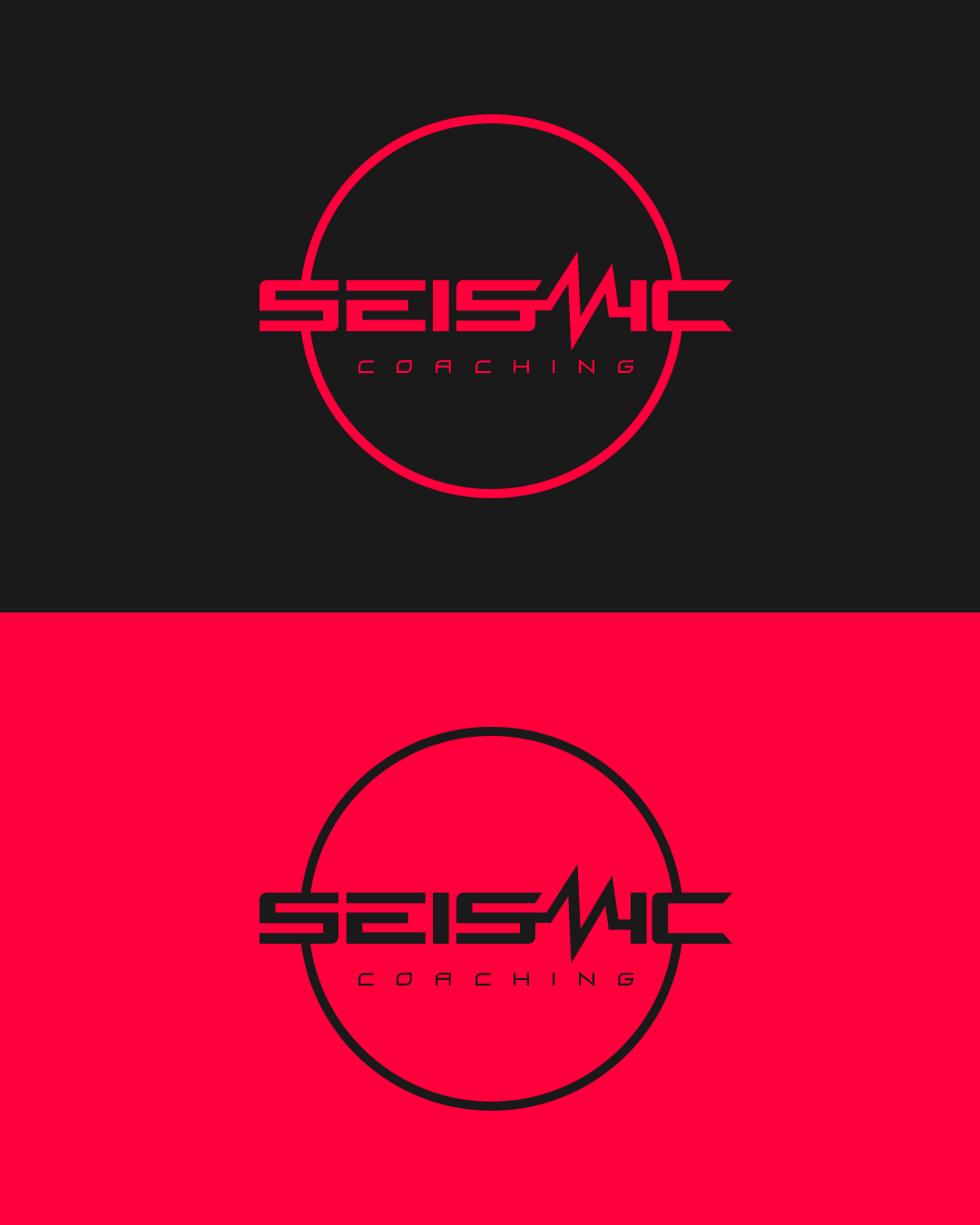
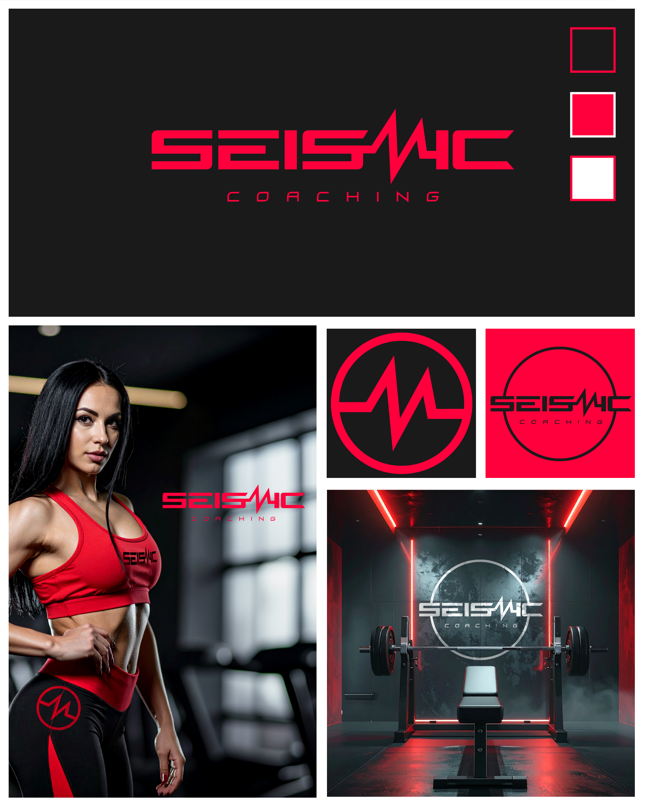
Logo Design: Strong, bold, and flexible (primary, secondary, brandmark) conveying intensity and performance.
Typography: Modern, clean, and dynamic fonts communicating energy and professionalism.
Colour Palette: Neon pink/red and black for a striking, high-energy presence.
Brand Assets
Digital templates, social media graphics, and marketing materials consistent with the bold aesthetic.
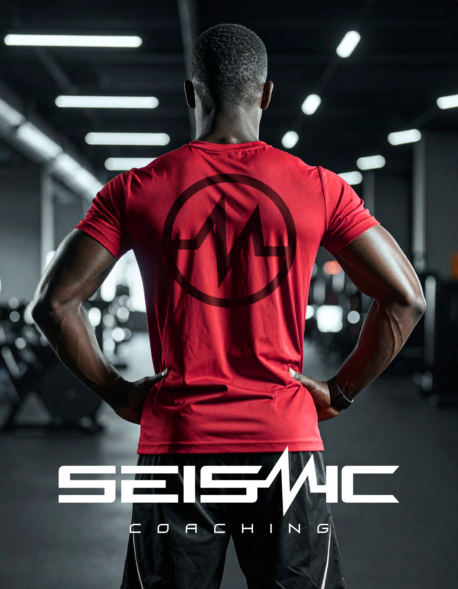
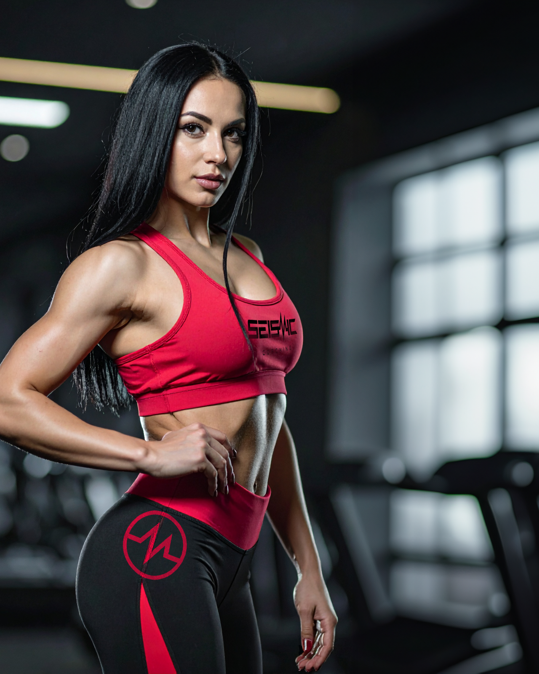
In-studio signage, apparel, and promotional items reinforcing the premium, modern feel.
Messaging & Tone of Voice
Confident, motivating, and aspirational copy.
Short, punchy messaging communicates results, intensity, and transformation.
Taglines suitable for digital marketing, social campaigns, and in-studio materials.
User Experience
Cohesive brand experience across website, social media, in-studio touchpoints, and promotional materials.
Messaging and visuals motivate clients from initial inquiry to committed training programs.
Expected Outcome
The branding ensures the studio:
Stands out as a premium, high-energy personal training studio
Communicates expertise, intensity, and results
Creates a cohesive brand experience across digital, in-studio, and promotional touchpoints
Attracts aspirational, motivated clients seeking elite-level fitness and transformation