

Strength
Engineered
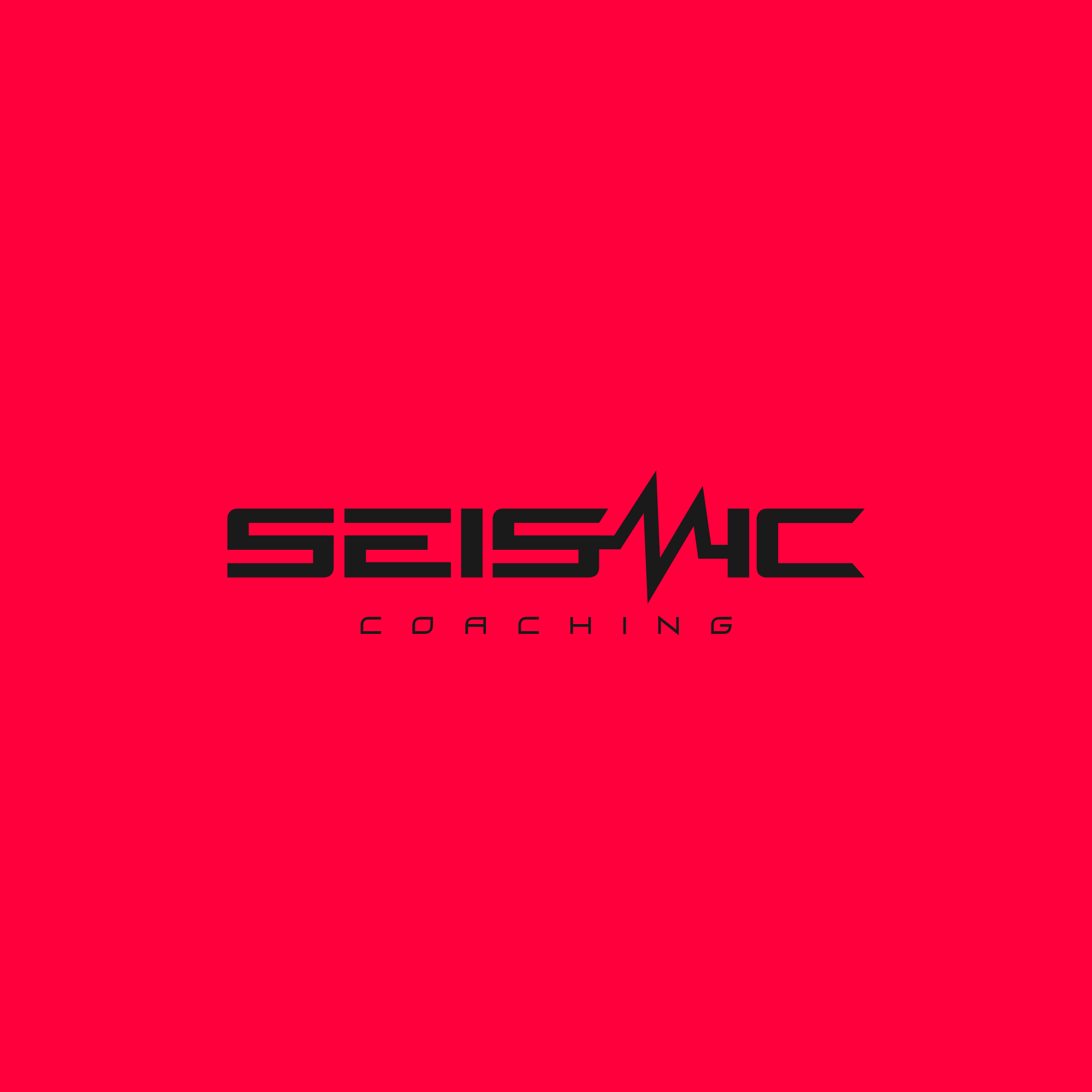

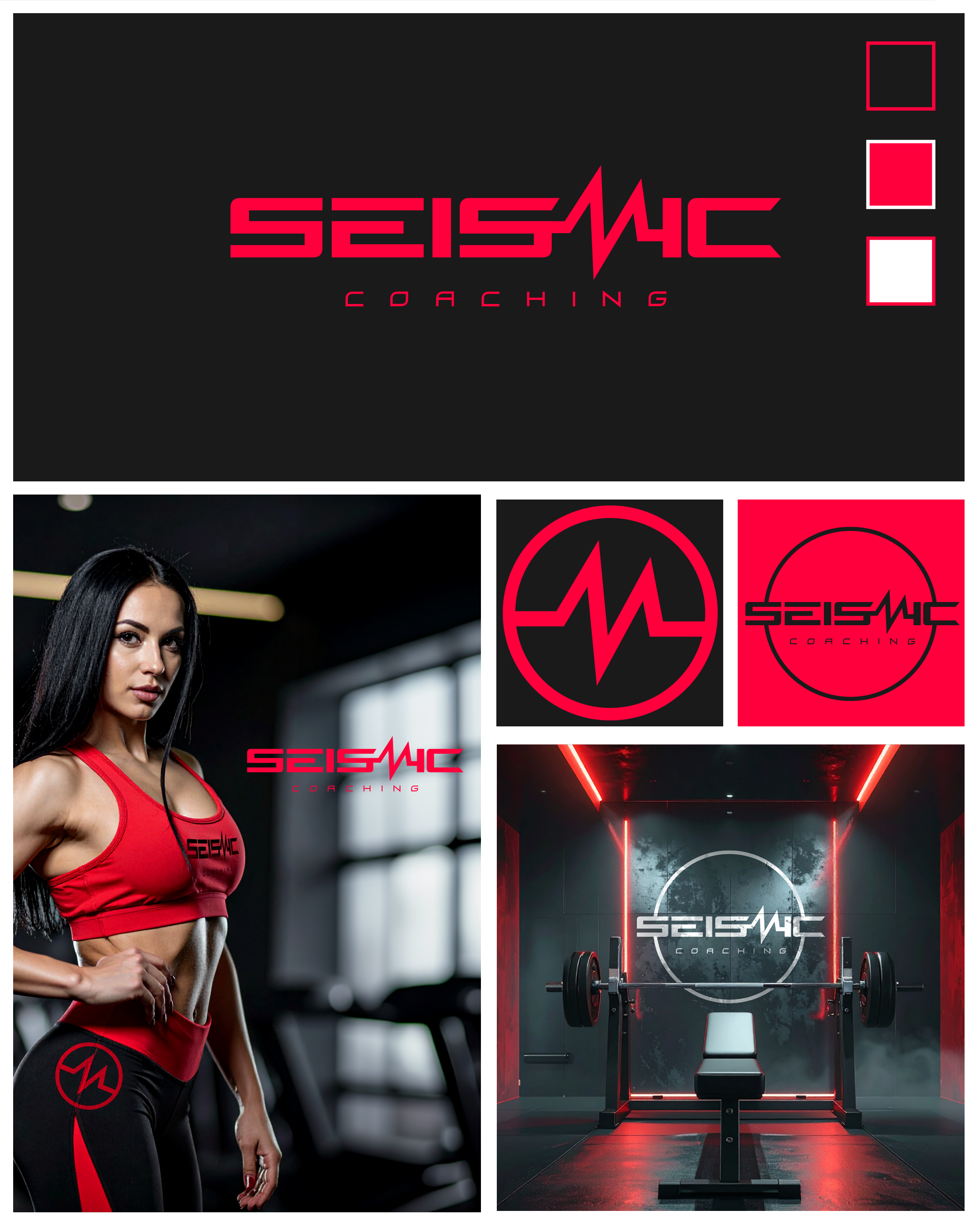
Seismic Coaching - Train Hard. Transform Fast.
Seismic Coaching is an elite personal training studio in Australia, designed for clients who want results, intensity, and a premium fitness experience. With highly qualified trainers, bespoke programs, and a focus on performance, every session is crafted to push limits and deliver transformation.
Our bold neon pink/red and black palette reflects the studio’s energy, modernity, and drive, creating an environment that motivates clients to train harder and smarter. Whether it’s strength, conditioning, or personal transformation, [Brand Name] provides a dynamic, professional, and inspiring fitness experience.
Train with purpose. Transform with results. Seismic Coaching is where elite fitness meets modern design.
the brief
Client Overview
Brand Type: Elite personal training / fitness studio
Location: Australia
Unique Selling Points: High-performance training, custom programs, elite-level expertise, motivating environment
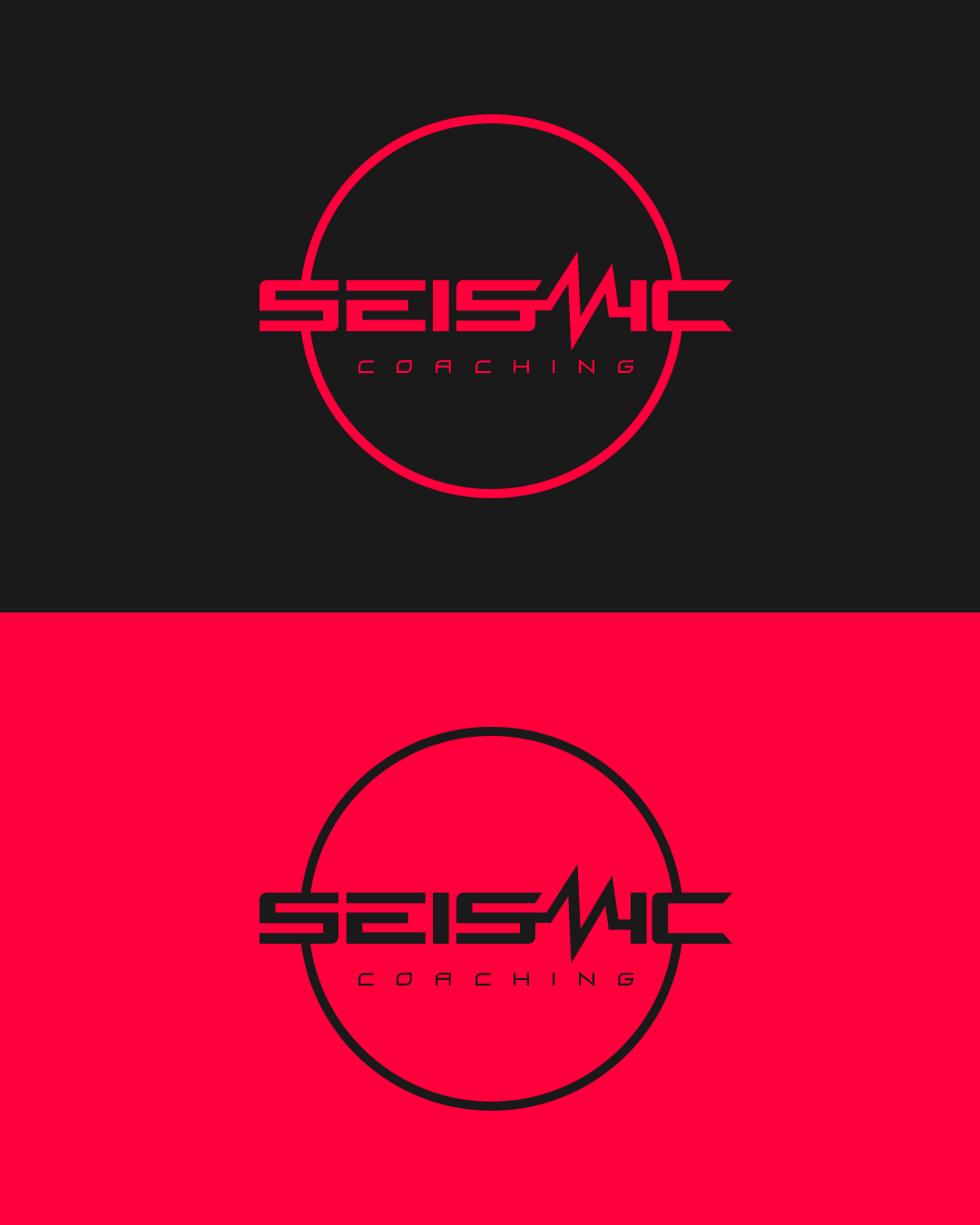
Colour Palette: Neon pink/red and black (dynamic, energetic, modern)
Design Aim / Goal
The branding positions the studio as a premium, high-energy personal training brand, communicating:
Energy & intensity: The brand feels dynamic, motivating, and modern.
Elite professionalism: It communicates expertise and high-level training results.
Confidence & transformation: Inspires clients to push themselves and trust the training process.
Modern and bold: Reflects current fitness trends and appeals to aspirational clients.
The branding stands out in a competitive market, attracting motivated individuals seeking a premium, transformative fitness experience.
Target Audience
Age 20–45, fitness-conscious professionals and enthusiasts
Clients who want personalized, high-performance training
Individuals motivated by results, transformation, and an energetic, bold environment
Socially engaged, active on Instagram and TikTok, appreciating visually striking branding
SkyPotion’s Approach
SkyPotion creates a strategic, high-impact visual identity that mirrors the energy and modernity of the studio:
Visual Identity
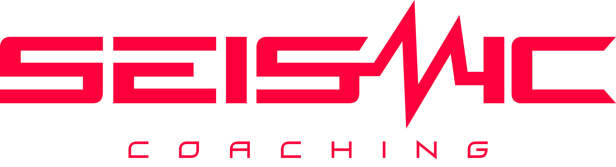
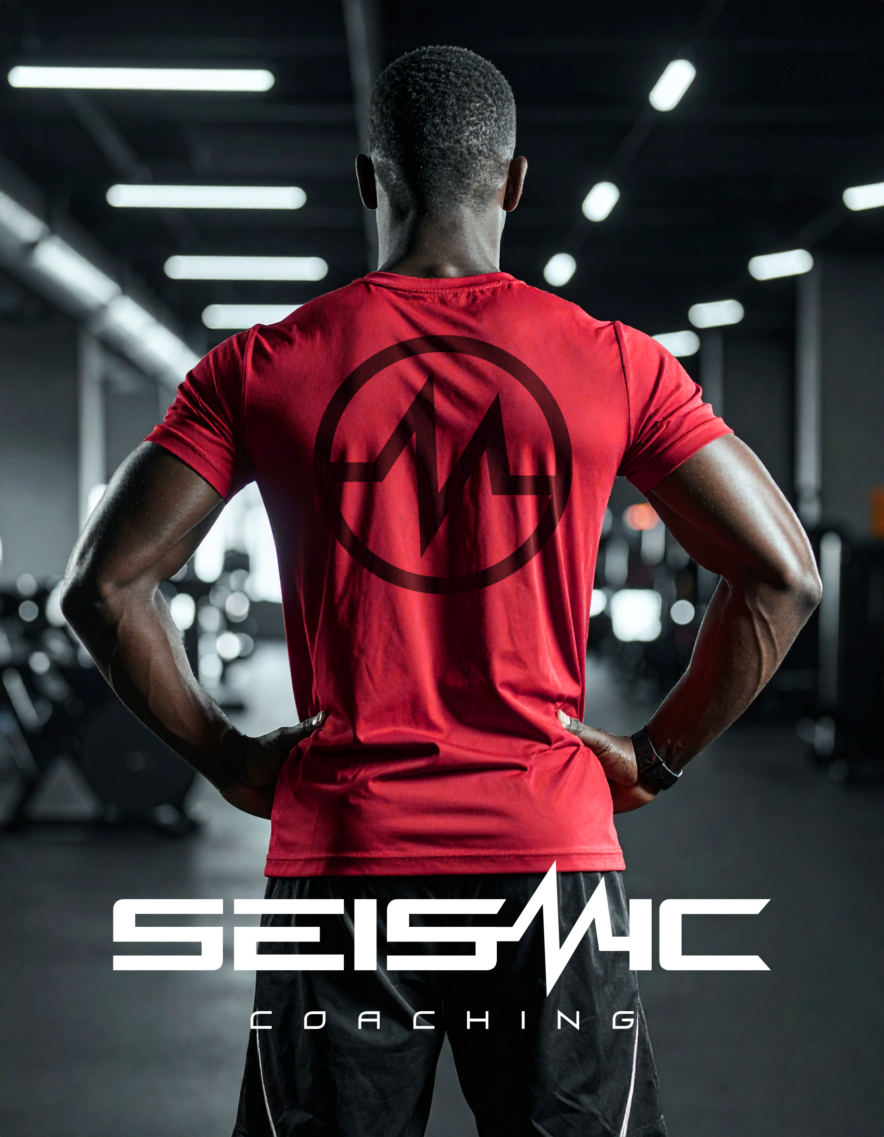
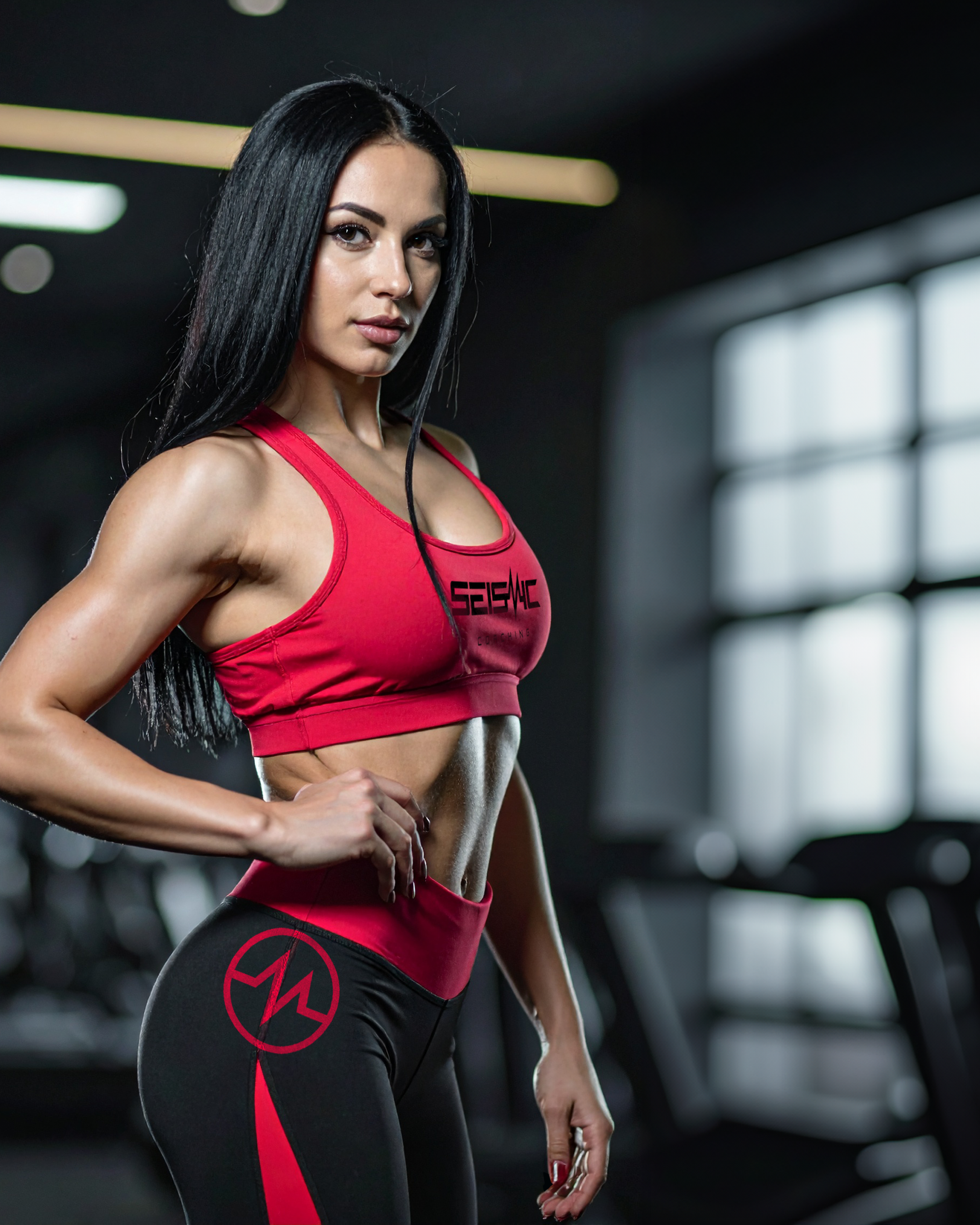
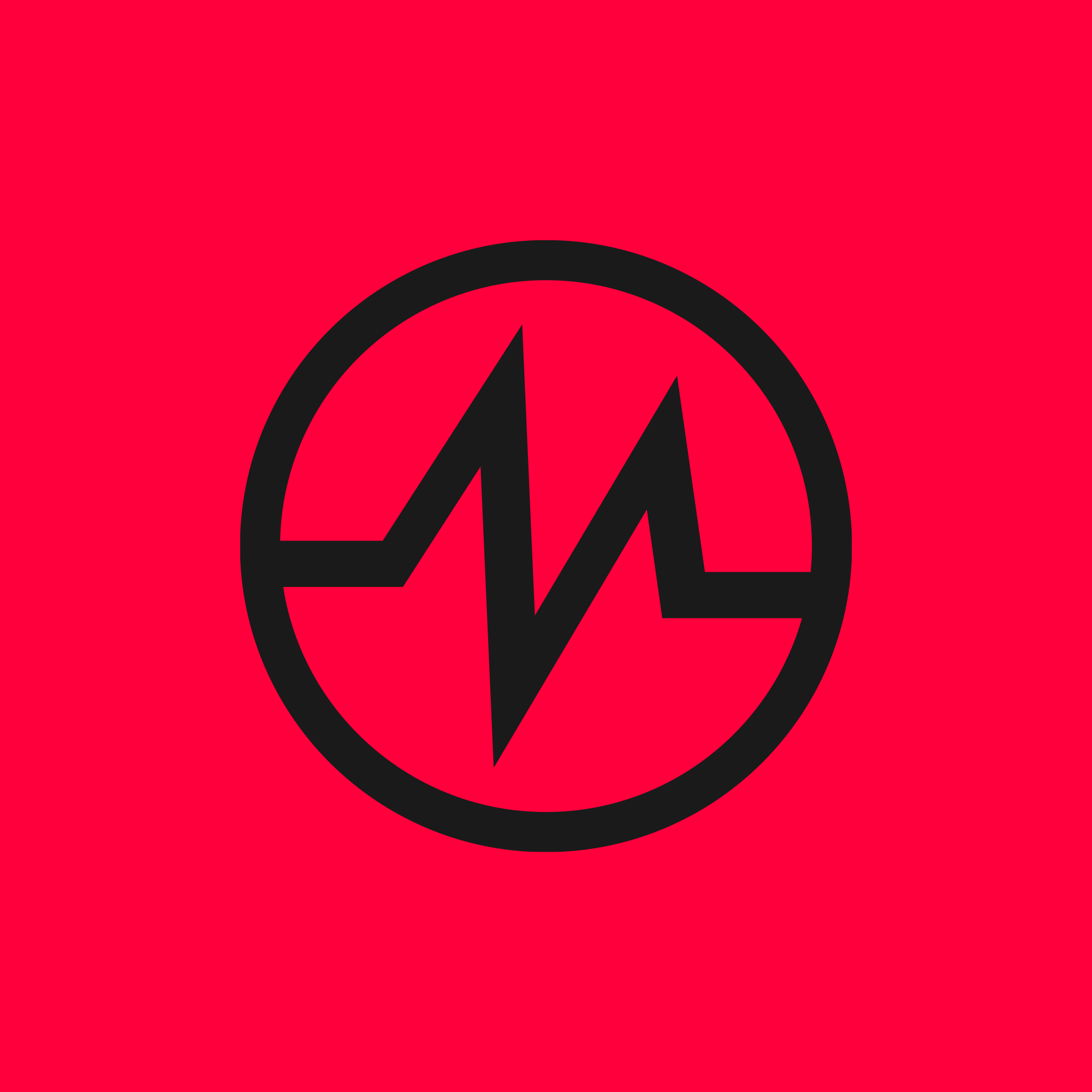
Logo Design: Strong, bold, and flexible (primary, secondary, brandmark) conveying intensity and performance.
Typography: Modern, clean, and dynamic fonts communicating energy and professionalism.
Colour Palette: Neon pink/red and black for a striking, high-energy presence.
Brand Assets
Digital templates, social media graphics, and marketing materials consistent with the bold aesthetic.
In-studio signage, apparel, and promotional items reinforcing the premium, modern feel.
Messaging & Tone of Voice
Confident, motivating, and aspirational copy.
Short, punchy messaging communicates results, intensity, and transformation.
Taglines suitable for digital marketing, social campaigns, and in-studio materials.
User Experience
Cohesive brand experience across website, social media, in-studio touchpoints, and promotional materials.
Messaging and visuals motivate clients from initial inquiry to committed training programs.
Expected Outcome
The branding ensures the studio:
Stands out as a premium, high-energy personal training studio
Communicates expertise, intensity, and results
Creates a cohesive brand experience across digital, in-studio, and promotional touchpoints
Attracts aspirational, motivated clients seeking elite-level fitness and transformation